Grainly Co.
Grainly Co. brings two decades of family farming heritage from Chhipadi, Gujarat, to the digital world. We built a narrative-driven website highlighting their millet cookies, stone-milled grains, and A2 ghee, all while honoring their strict pledge: no palm oil and no processed flours.
4
Pages Built
100%
Responsive
5+
Integrations
How We Helped
Grainly Co. needed a premium digital home that could carry two decades of family-farm heritage without feeling rustic or dated. The site had to make a dense product promise — 80/20 millet-to-wheat, zero palm oil, in-house stone milling, A2 Gir-cow ghee, jaggery sweetening — instantly understandable, build trust with conscious-food buyers, and route every visitor into a real Whatsapp-led inquiry instead of a generic contact form.
Strategy & Development
Editorial Heritage Aesthetic
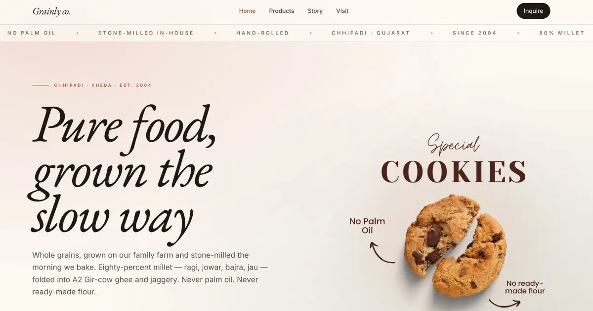
Crafted a warm, editorial identity using a classic serif display font, hand-painted product cutouts, and a cream + cocoa + terracotta palette that evokes a 20-year-old family farm.
Story-Led Conversion Layout
Built the homepage around the brand promise — 80/20 millet-wheat, 0% palm oil, in-house stone milling, 20+ year legacy — with one primary CTA (Taste the range) and a soft secondary CTA (Read the manifesto).
Marquee Trust Strip
Replaced a generic features grid with a slow auto-scrolling marquee of brand truths (No Palm Oil · Stone-milled · Hand-rolled · Chhipadi · Since 2004 · 80% Millet) that reinforces trust without taking visual weight.
Performance & Motion Polish
Lazy-loaded product motion videos, optimized WebP imagery, and subtle in-view reveals on the hero, product cards, and story sections — fast on mobile, premium on desktop.
Optimized for Every Device
The website is fully responsive with optimized layouts for mobile, tablet, and desktop devices
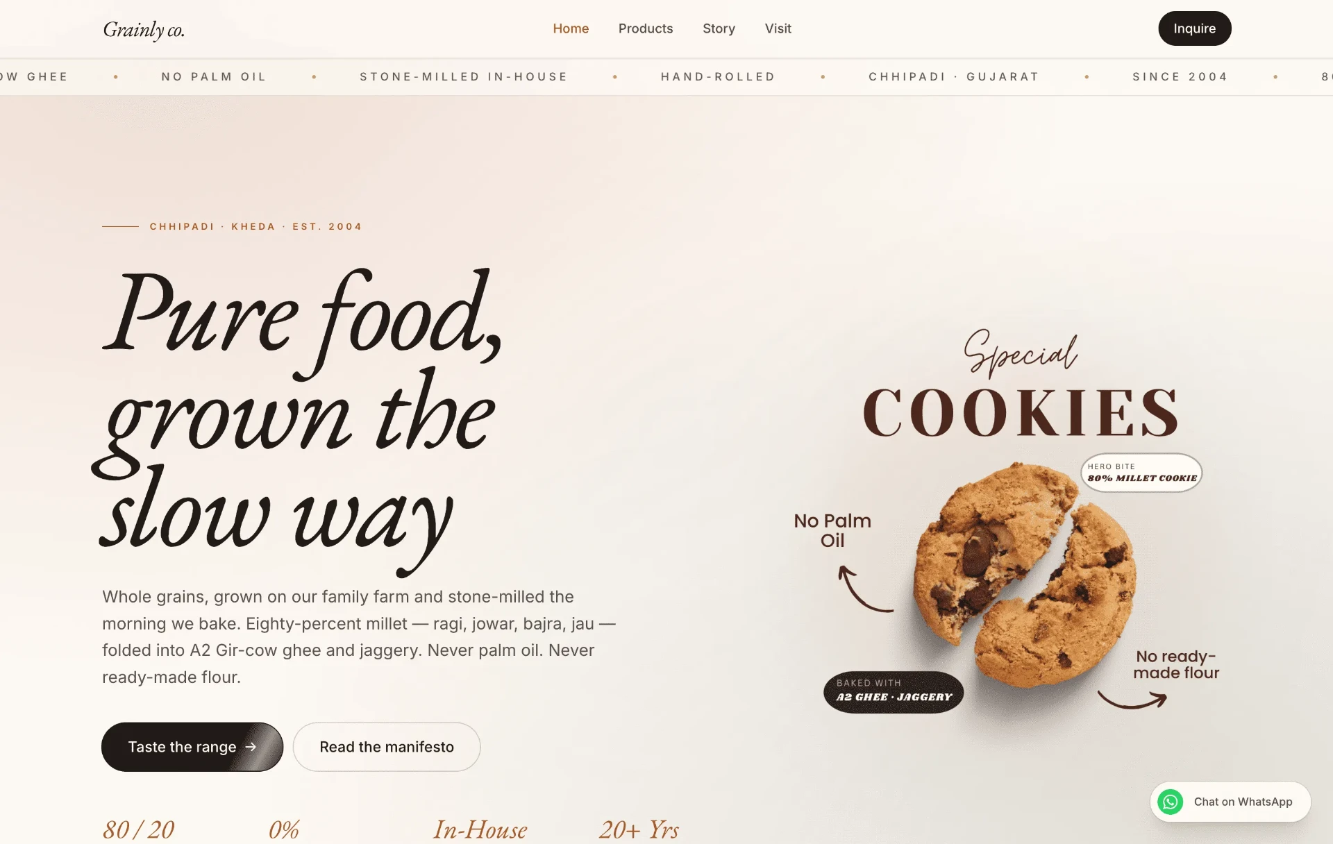
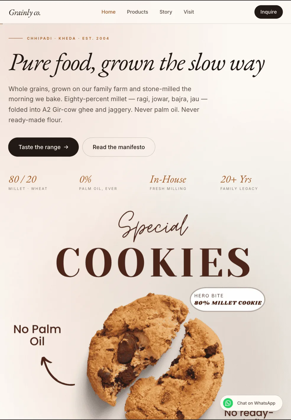
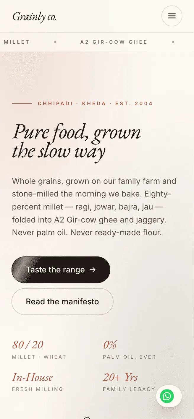
Mobile
< 640px
- Single-column editorial layout
- Compact marquee trust strip
- Floating Whatsapp inquire CTA
- Touch-optimized product cards
Tablet
640px – 1024px
- 2-column product and story grids
- Larger serif headline scale
- Balanced hero with cookie cutout
- Sticky compact navigation
Desktop
> 1024px
- Split hero: headline + cookie hero shot
- Full-width marquee under navigation
- Dual CTA — Taste the range + Manifesto
- Hover micro-interactions on products
What We Built
Pages Developed
Home
Story-led landing page with hero, manifesto strip, and product highlights
Products
Full catalogue of millet cookies, khakhras, ghee, jaggery, and grains
Story
Family farm legacy, Chhipadi-Kheda heritage, and stone-milling process
Visit
Farm visit details, location map, and inquiry CTA
Tech Stack Used
Integrations
Inquire button + floating chat for direct orders
Embedded brand feed and social proof
Google Maps
Embedded farm location for visits
Lead Form
Inquiry form with email + Whatsapp routing
Lottie / Video
Cookie & khakhra product motion loops
Key Goals Achieved
Heritage Storytelling
Eyebrow date, serif hero, farm + portrait imagery
Trust Building
80/20 stats, marquee trust strip, family legacy copy
Product Discovery
Special Cookies hero feature, products page grid
Lead Capture
Inquire CTA, floating Whatsapp, Visit page form
SEO
Semantic HTML, meta tags, OG image, canonical URLs
The Results
4
Pages Delivered
Home, Products, Story, and Visit pages
100%
Responsive
Mobile, tablet, and desktop optimized
Fast
Load Time
WebP + lazy-loaded videos & images
20+ Yrs
Legacy Captured
Family farm story told visually
Challenges & Solutions
Translating Heritage Into Web Design
Problem
A 20-year family farm with no digital identity needed to feel premium without losing its rustic warmth.
Solution
Used a classic serif display + warm cream palette, hand-painted style product cutouts, and a Chhipadi · Kheda · Est. 2004 eyebrow on the hero to anchor heritage instantly.
Communicating a Complex Product Promise Quickly
Problem
The brand promise — 80/20 millet-wheat, 0% palm oil, in-house stone milling, A2 Gir-cow ghee, jaggery — is dense and easy to overlook.
Solution
Broke the promise into four scannable hero stats (80/20, 0%, In-House, 20+ Yrs) and a continuously scrolling marquee of brand truths under the nav.
Driving Orders Without an Ecommerce Cart
Problem
The brand prefers Whatsapp-led inquiries over a full cart checkout in this phase.
Solution
Used a single high-contrast Inquire button in the header, a floating Whatsapp CTA, and a Visit page with map + form to route every intent into a real conversation.
Giving a 20-Year Family Farm a Digital Front Door
Grainly Co. had two decades of genuine heritage — stone milling, an 80/20 millet-to-wheat ratio, and a strict no-palm-oil pledge — but nothing online to communicate it. The risk was building a site that looked either too rustic to feel credible or too polished to feel authentic to a real family farm.
We anchored the design in a warm editorial identity — a classic serif display, hand-painted product cutouts, and a cream-cocoa-terracotta palette — then broke the dense product promise into four scannable hero stats and a continuously scrolling marquee of brand truths under the navigation. This let visitors absorb the credibility signals in seconds rather than reading paragraphs of copy.
Since the brand prefers direct relationships over a cart checkout, every path — the header Inquire button, the floating WhatsApp CTA, and the Visit page form — was designed to route interest into a real conversation. Heritage or legacy brands considering a similar move online can see how our website development team approaches storytelling-first design.
Key Takeaways
- A marquee-style trust strip communicates dense brand claims faster than a traditional features grid.
- Editorial typography and warm color palettes can make a legacy brand feel premium without losing authenticity.
- Breaking a complex product promise into a handful of scannable stats improves comprehension at a glance.
- For brands favoring relationship-led sales, WhatsApp-first CTAs outperform generic contact forms.
Questions About This Project
Explore More Success Stories
See how we've helped other businesses achieve measurable growth.